Week 1
The instructions for Week 1 of 2022 are short:
This was really just a bring your own dataset week.
Data
Let’s look at some football (soccer) data from main European leagues. I use the data as distributed in the engsoccerdata package.
First load the package after installing it if needed.
if(!require("tidyverse")){install.packages("tidyverse")}
library(tidyverse)

if(!require("devtools")){install.packages("devtools")}
library(devtools)

if(!require("engsoccerdata")){install_github("jalapic/engsoccerdata")}
library(engsoccerdata)

if(!require("patchwork")){install.packages("patchwork")}
library(patchwork)
Load data from England, France, Germany, Italy and Spain.
# load data
df_eng <- engsoccerdata::england
df_fra <- engsoccerdata::france
df_ger <- engsoccerdata::germany
df_ita <- engsoccerdata::italy
df_esp <- engsoccerdata::spain
Data wrangling
We want to add all data to one data frame. Some columns are missing, so let’s quickly compute them.
# Germany is missing the columns for total goals, goal difference and result
# Let's create these
df_ger <- df_ger %>%
    mutate(totgoal = hgoal + vgoal,
           goaldif = hgoal + vgoal,
           result = case_when(hgoal > vgoal ~ "H",
                              vgoal > hgoal ~ "A",
                              hgoal == vgoal ~ "D"),
           country = "Germany")

df_ita <- df_ita %>%
    mutate(division = 1,
           totgoal = hgoal + vgoal,
           goaldif = hgoal + vgoal,
           result = case_when(hgoal > vgoal ~ "H",
                              vgoal > hgoal ~ "A",
                              hgoal == vgoal ~ "D"),
           country = "Italy")

df_esp <- df_esp %>%
    filter(round == "league") %>%
    select(-round, -group, -notes, -HT) %>%
    mutate(division = 1,
           totgoal = hgoal + vgoal,
           goaldif = hgoal + vgoal,
           result = case_when(hgoal > vgoal ~ "H",
                              vgoal > hgoal ~ "A",
                              hgoal == vgoal ~ "D"),
           country = "Spain")

df_eng <- df_eng %>%
    mutate(country = "England")

df_fra <- df_fra %>%
    mutate(country = "France",
           result = case_when(hgoal > vgoal ~ "H",
                              vgoal > hgoal ~ "A",
                              hgoal == vgoal ~ "D")
    )

# build common data frame
df <- rbind(df_eng, df_ger, df_esp, df_ita, df_fra)
Home field advantage
All leagues
First, let’s compute the proportions of home wins, away wins and draws irrespective of country (i.e. league).
# result proportions by country
df_win <- df %>%
group_by(Season) %>%
summarise(home_win = sum(result == "H")/n(),
away_win = sum(result == "A")/n(),
draw = sum(result == "D")/n(),
.groups = "drop") %>%
pivot_longer(cols = c(home_win, away_win, draw), names_to = "result")
# df for labelling
df_label = df_win %>%
filter(Season == max(Season)) %>%
mutate(label = case_when(result == "home_win"~"Home Win",
result == "away_win"~"Away Win",
result == "draw"~"Draw")
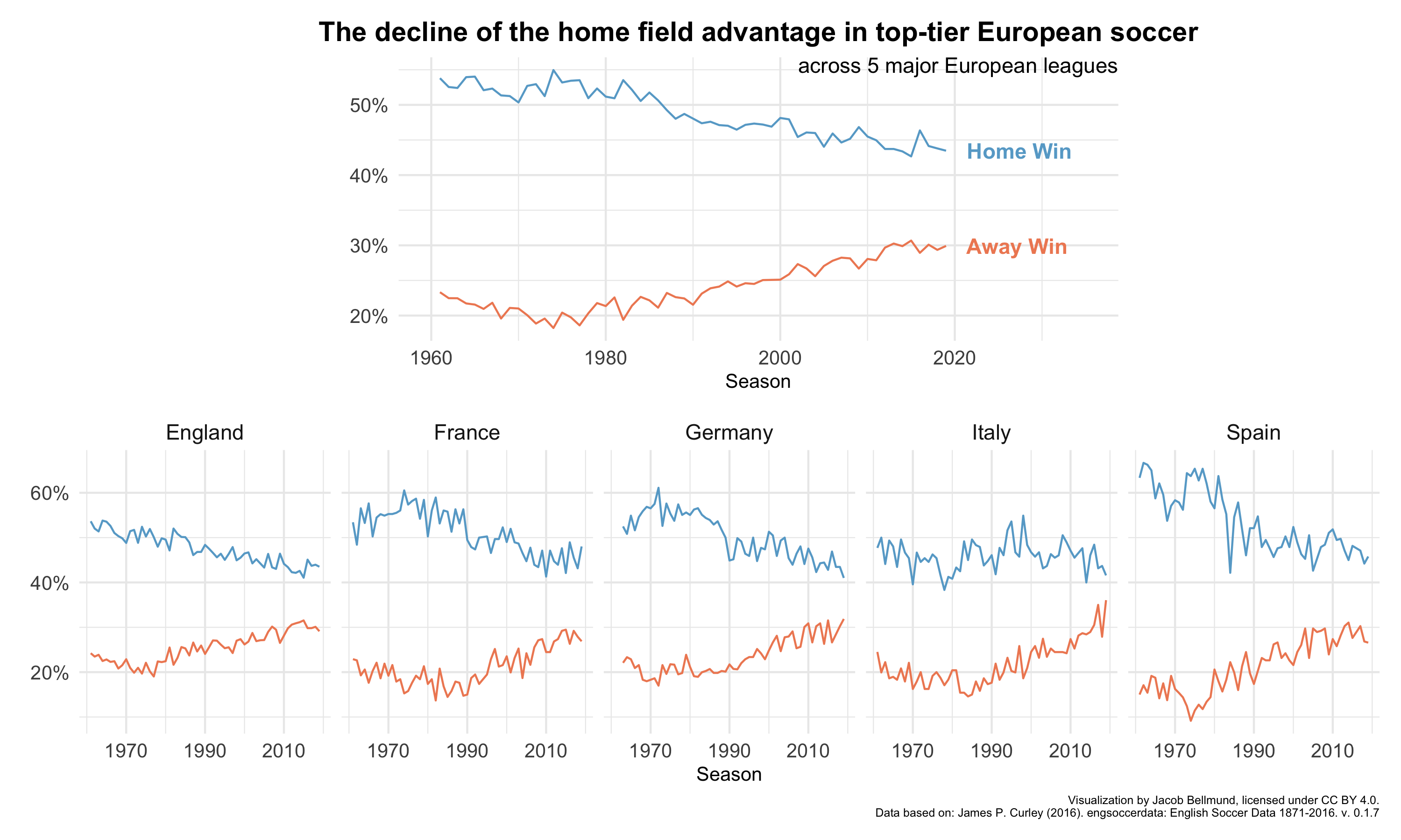
)Visualize percentages of home vs. away wins over time as a line graph.
# plot as line graph
p1 <- ggplot(df_win %>% filter(Season > 1960, result != "draw"),
       aes(x = Season,
           y = value,
           group = result,
           color = result)) +
    geom_line() +
    geom_text(data = df_label %>% filter(result != "draw"),
              aes(x = Season, y = value, label = label),
              hjust = -0.2, alpha = 1, fontface = "bold") +
    xlim(c(1960, 2035)) +
    scale_color_manual(values = c("#ef8a62", "#67a9cf")) +
    scale_y_continuous(labels = scales::percent_format(accuracy = 1)) +
    ylab(element_blank()) +
    ggtitle("The decline of the home field advantage in top-tier European soccer") +
    annotate(geom = "text", label = "across 5 major European leagues",
             x=Inf, y=Inf, hjust = 1, vjust = 1,
             size = 11/.pt, face = "bold") +
    theme_minimal() +
    theme(legend.position = "none",
          text = element_text(size=10),
          plot.title = element_text(size = 14, face = "bold", hjust = 0.5),
          axis.text = element_text(size=10))
## Warning: Ignoring unknown parameters: facep1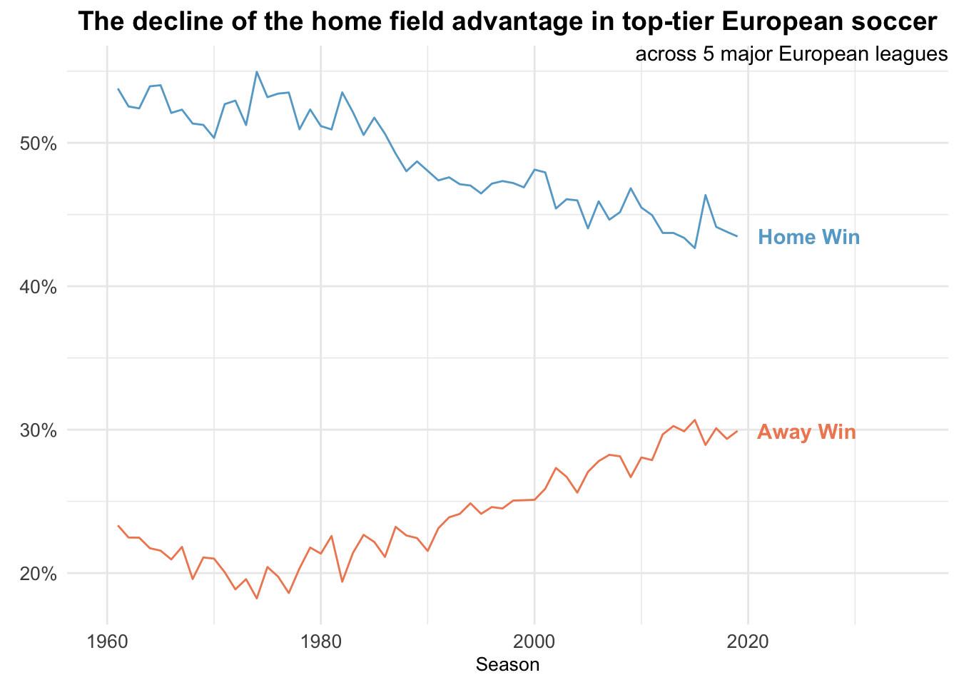
Leagues separately
Second, we repeat the above steps, but separately for each country.
# result proportions by country
df_win_country <- df %>%
    group_by(country, Season) %>%
    summarise(home_win = sum(result == "H")/n(),
              away_win = sum(result == "A")/n(),
              draw = sum(result == "D")/n(),
              .groups = "drop") %>%
    pivot_longer(cols = c(home_win, away_win, draw), names_to = "result")

# df for labelling
df_label = df_win_country %>%
    group_by(country) %>%
    filter(Season == max(Season)) %>%
    mutate(label = case_when(result == "home_win"~"Home Win",
                             result == "away_win"~"Away Win",
                             result == "draw"~"Draw")
    )
Make a line plot with one facet per country
# plot as line graph with one facet per country
p2 <- ggplot(df_win_country %>% filter(Season > 1960, result != "draw"),
       aes(x = Season,
           y = value,
           group = result,
           color = result)) +
    geom_line() +
    #geom_text(data = df_label %>% filter(result != "draw"),
    #          aes(x = Season, y = value, label = label),
    #          hjust = -0.2, alpha = 1, fontface = "bold") +
    #xlim(c(1960, 2026)) +
    scale_color_manual(values = c("#ef8a62", "#67a9cf")) +
    scale_x_continuous(breaks = seq(1970, 2010, 20),
                       minor_breaks = seq(1960, 2020, 20)) +
    scale_y_continuous(labels = scales::percent_format(accuracy = 1)) +
    ylab(element_blank()) +
    facet_wrap(~country, nrow = 1) +
    labs(caption = "Visualization by Jacob Bellmund, licensed under CC BY 4.0.\nData based on: James P. Curley (2016). engsoccerdata: English Soccer Data 1871-2016. v. 0.1.7")+
    theme_minimal() +
    theme(legend.position = "none",
          text = element_text(size=10),
          axis.text = element_text(size=10),
          strip.text = element_text(size = 11),
          plot.caption = element_text(size=6))
p2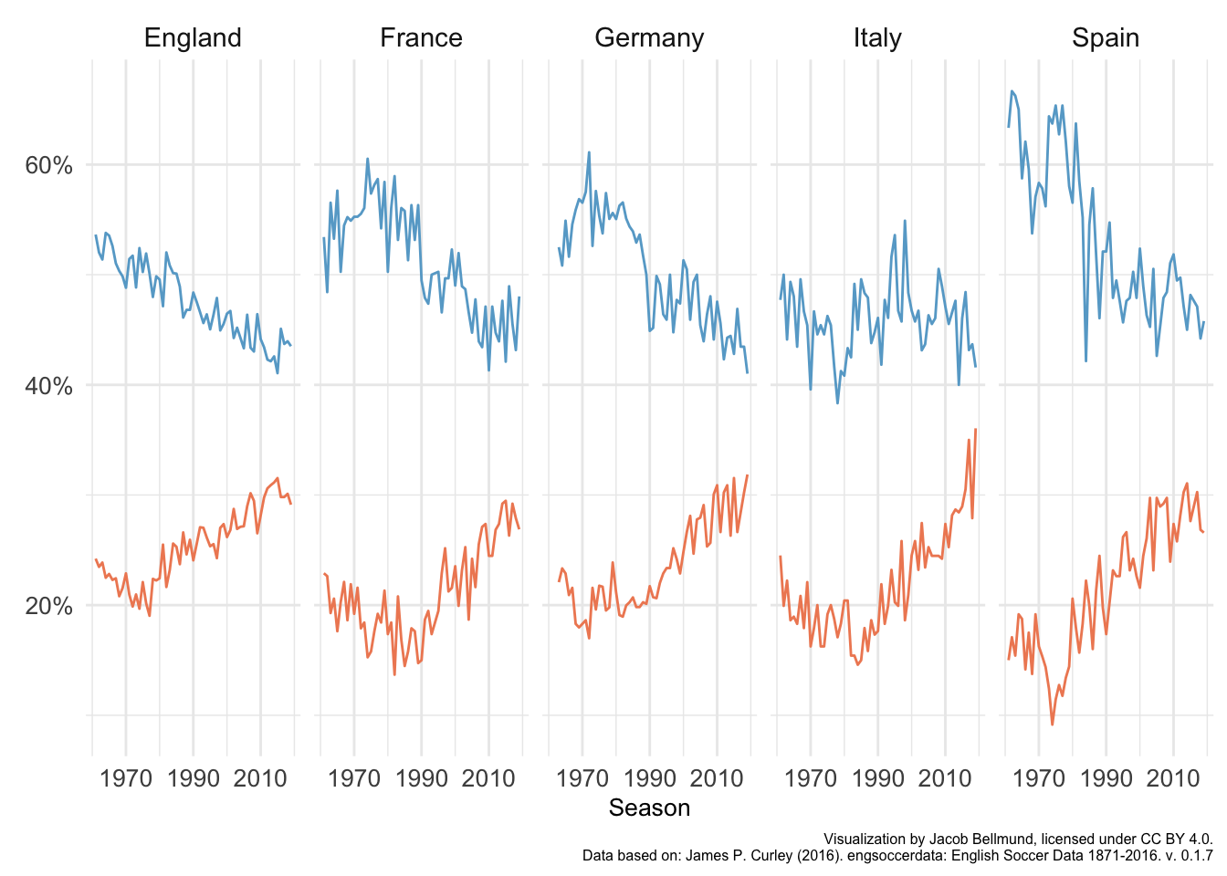
Visualization
dsgn <- "
ABBBC
DDDDD
"
p <- plot_spacer() + p1 +  plot_spacer() + p2 +
    plot_layout(design = dsgn, guides = "keep")
p
ggsave(filename = here("figures", "bellmund_tidytuesday_2022_wk01.png"), plot = p,
       width = 10, height = 6)
Here is the final visualization with the correct aspect ratio: